What your visitors see
This is the journey end to end, screen by screen. Every step can be switched on or off for each catalogue, so not every Gateway shows all of them.
1. Arriving
The visitor scans a QR code or opens a link and lands directly on the catalogue you have chosen for that campaign, market or audience. A link can also open the try-on straight away, skipping the menu.
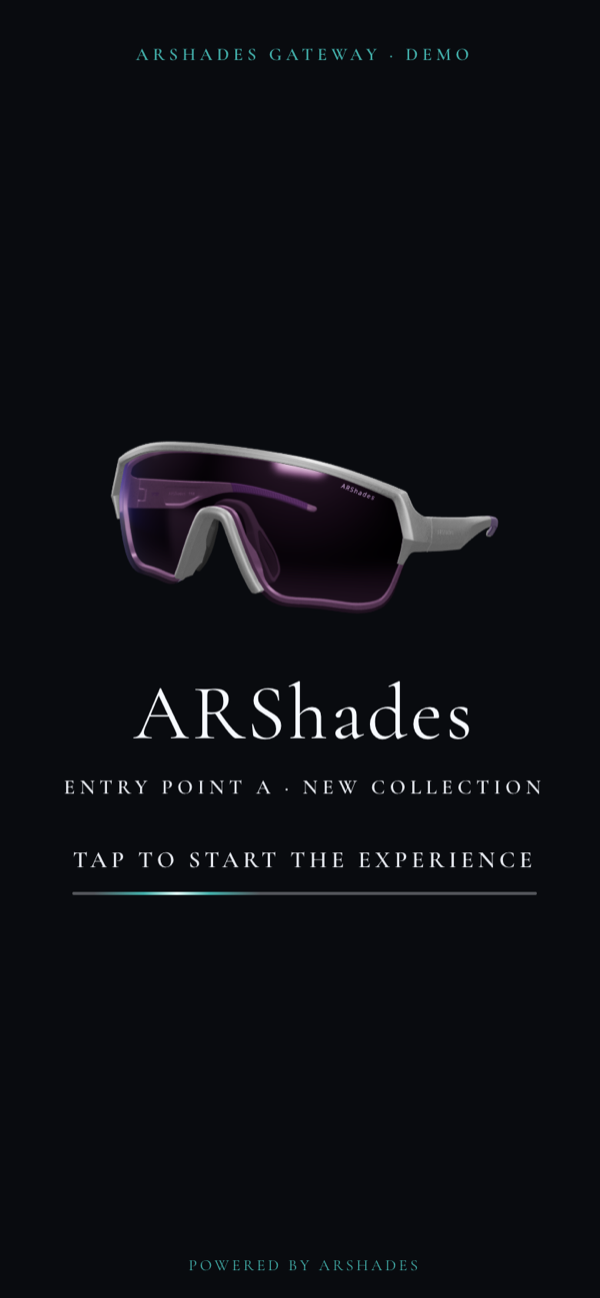
The experience can open with a short looping video and an invitation to start — useful for events and launches — or with a still image, or go straight to the menu. The opening is switched on or off per Gateway.
2. Before anything else: consent
The first tap leads to the consent screen. Your terms and your privacy notice are there to read, the visitor accepts, and only then does the experience open. Nothing is measured and no camera is touched before this point.
This screen is where you can see how ARShades treats the people who try on. Consent does not turn up once the experience is already running, to be got out of the way: it comes first, and it is the condition for the experience to begin at all. The screen speaks the language the visitor has chosen, says plainly what is about to happen, and the choice is not final — the shield button stays in a corner of every screen, and from there the visitor can review their choices or withdraw consent at any time. A virtual try-on points a camera at a person's face: to us that is the part of the experience that deserves more care, not less, and the Gateway hands it to you already looked after.
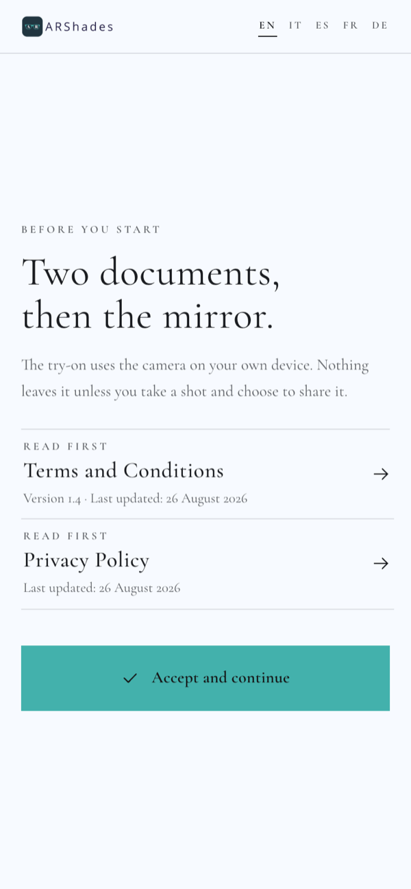
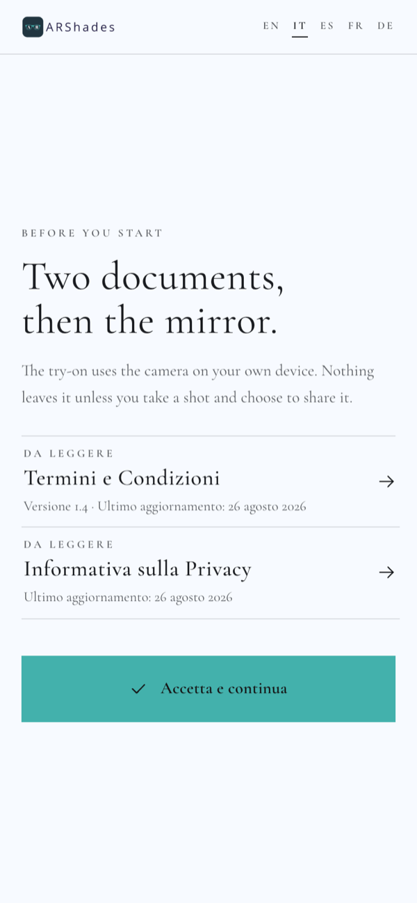
The same screen, in two of the five ready languages. The visitor picks the language from the top of the screen, and the whole experience follows.
3. The home menu
The menu is the front door: a few clear choices, in your own wording.
Below are the menus of four catalogues behind one and the same Gateway — one QR code, four audiences. The entries differ because each catalogue decides which sections it shows and in which order.
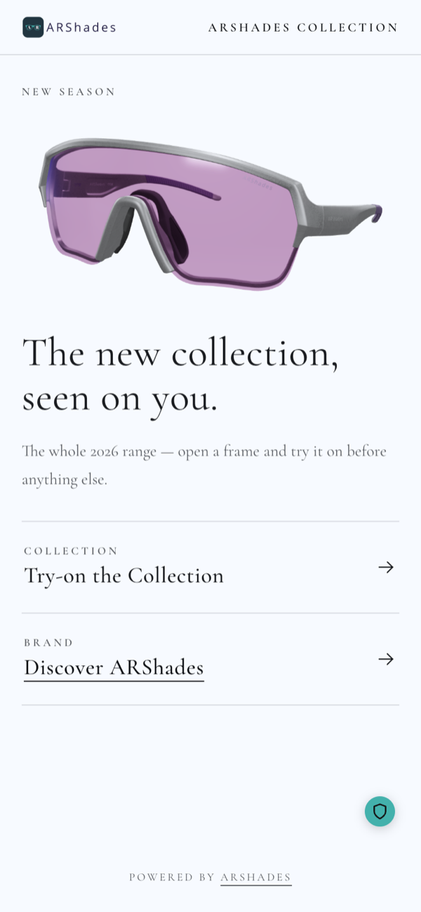
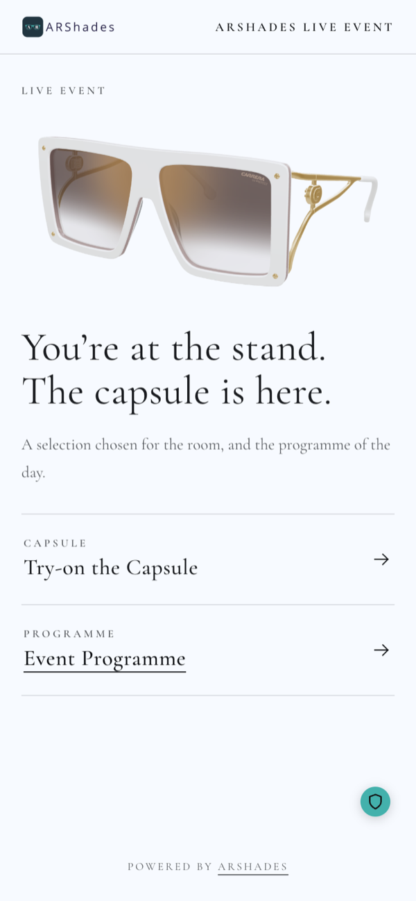
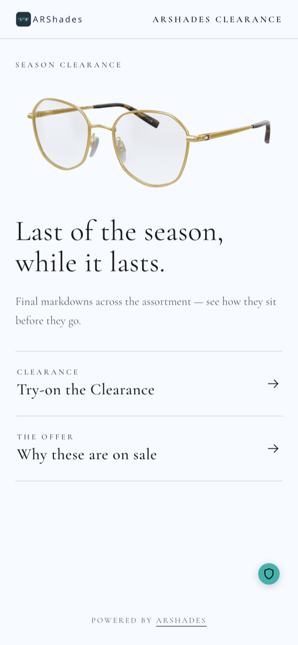
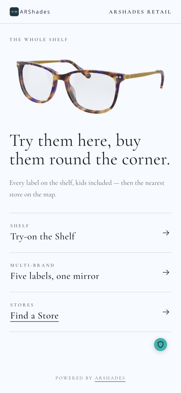
A campaign catalogue may show only the story and the try-on, while your permanent brand catalogue shows everything, and only your retail catalogue offers the store locator. Entries can also appear only when they are relevant.
4. Discovering the brand
Editorial pages tell the story: sequences of text, images and video, with a product carousel that takes the visitor straight from the story to the frame.
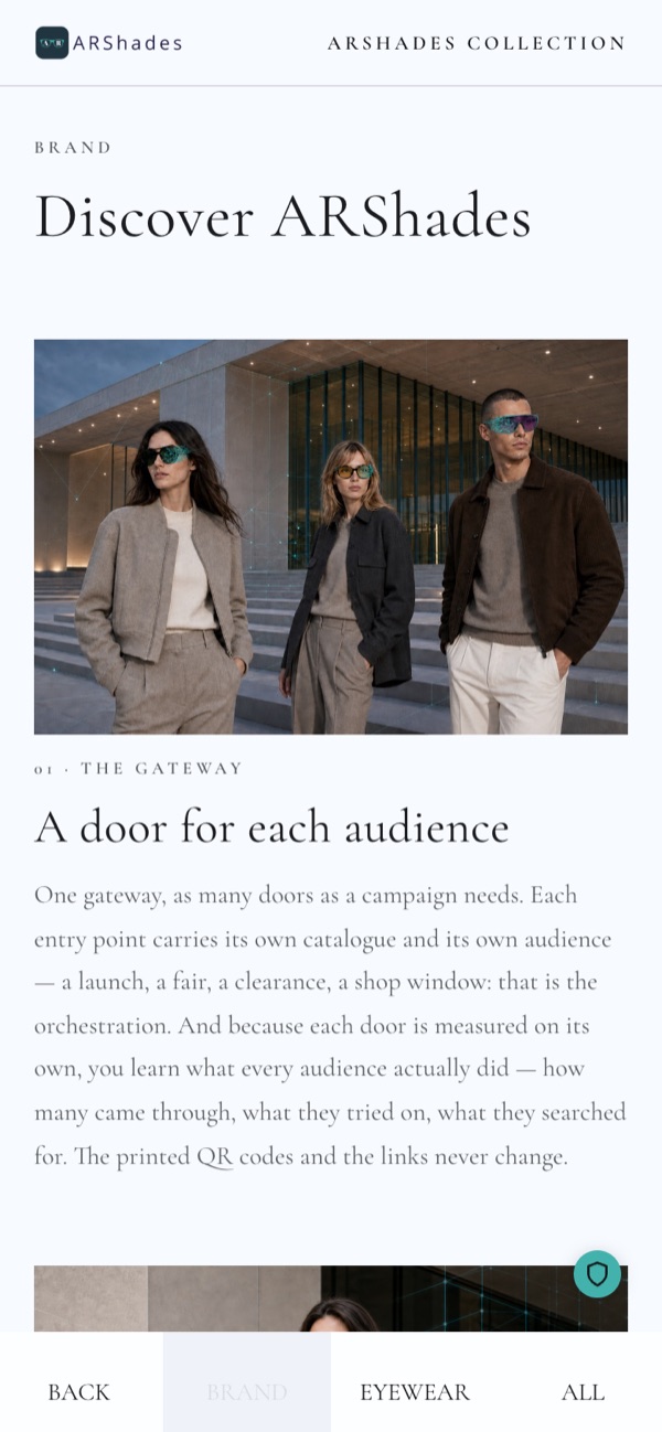
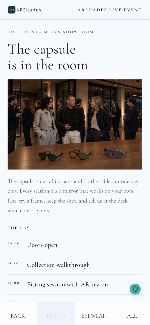
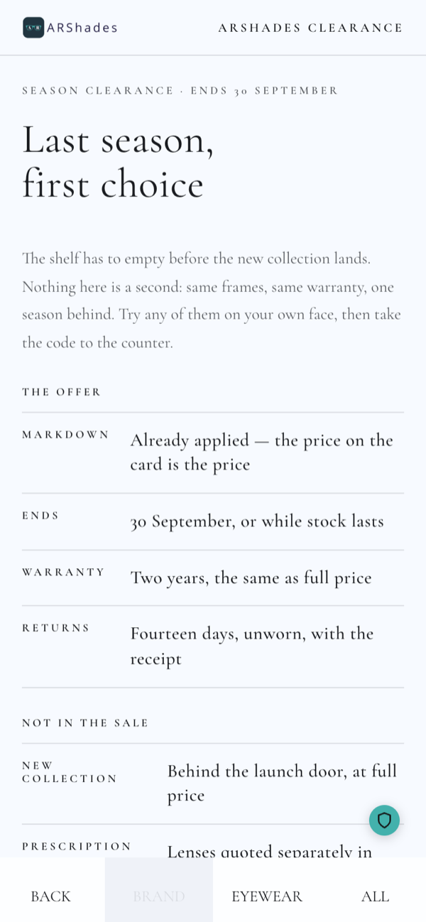
The brand page is part of your Gateway. Further pages — an event programme, the terms of an offer, a capsule, a sub-collection — are added as optional pages, and each catalogue can carry its own.
5. Finding the right frame
Instead of dropping the visitor into a long grid, the Gateway asks a few short questions and narrows the collection down for them.
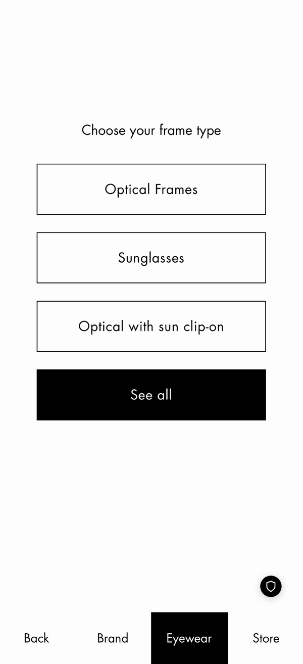
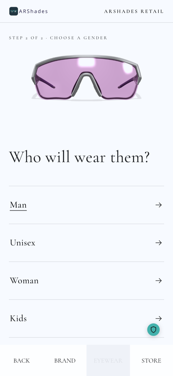
The available steps are frame type, gender, frame shape, occasion of use and face shape. You choose which ones to use and in which order, and the header counts them for the visitor — step 1 of 2. A step that would not change the result is skipped automatically, so the visitor never answers a pointless question: the kids entry on the right appears only because that catalogue actually carries children's frames. Anyone in a hurry can tap See all and go straight to the full collection.
6. Browsing the collection
The grid shows the frames that match, each with the number of colour variants available and a coloured track that previews them. Filters narrows the list by the product attributes you have on file — shape, colour, material, and the tags you use to feature a family. Where your template offers it, a search box also finds a model by name or code.
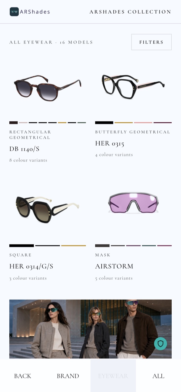
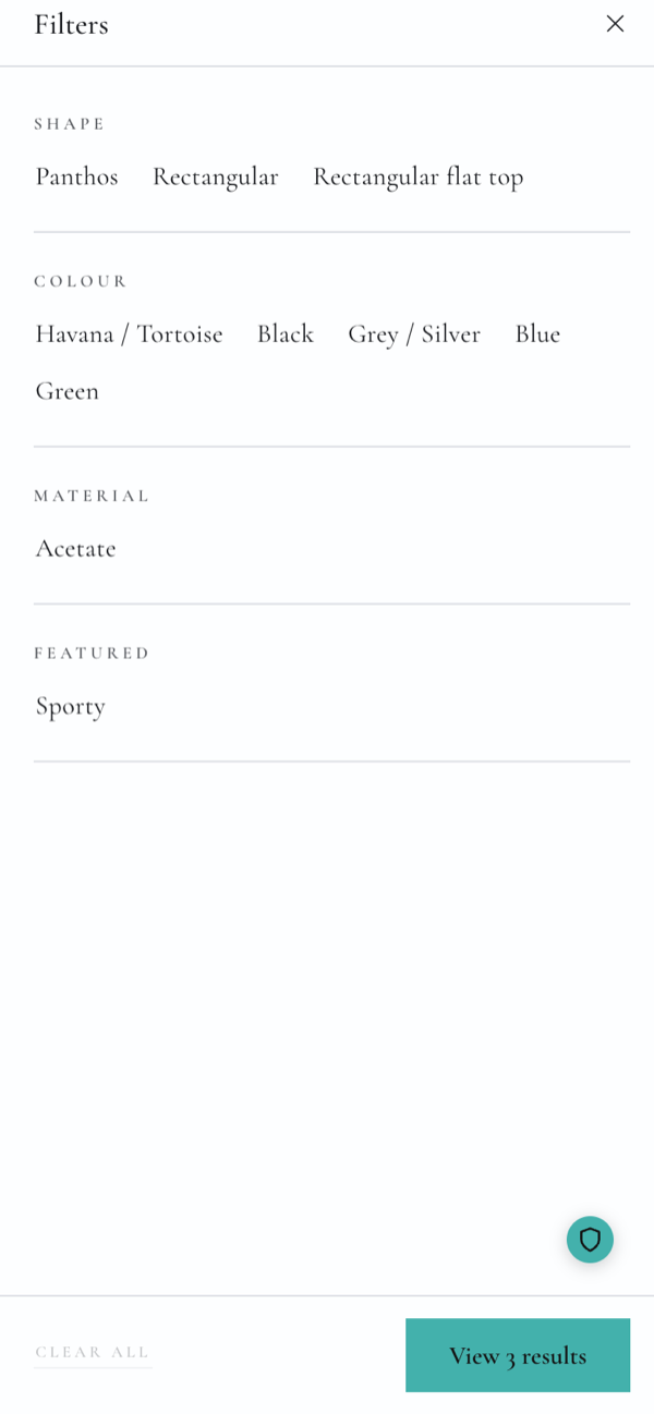
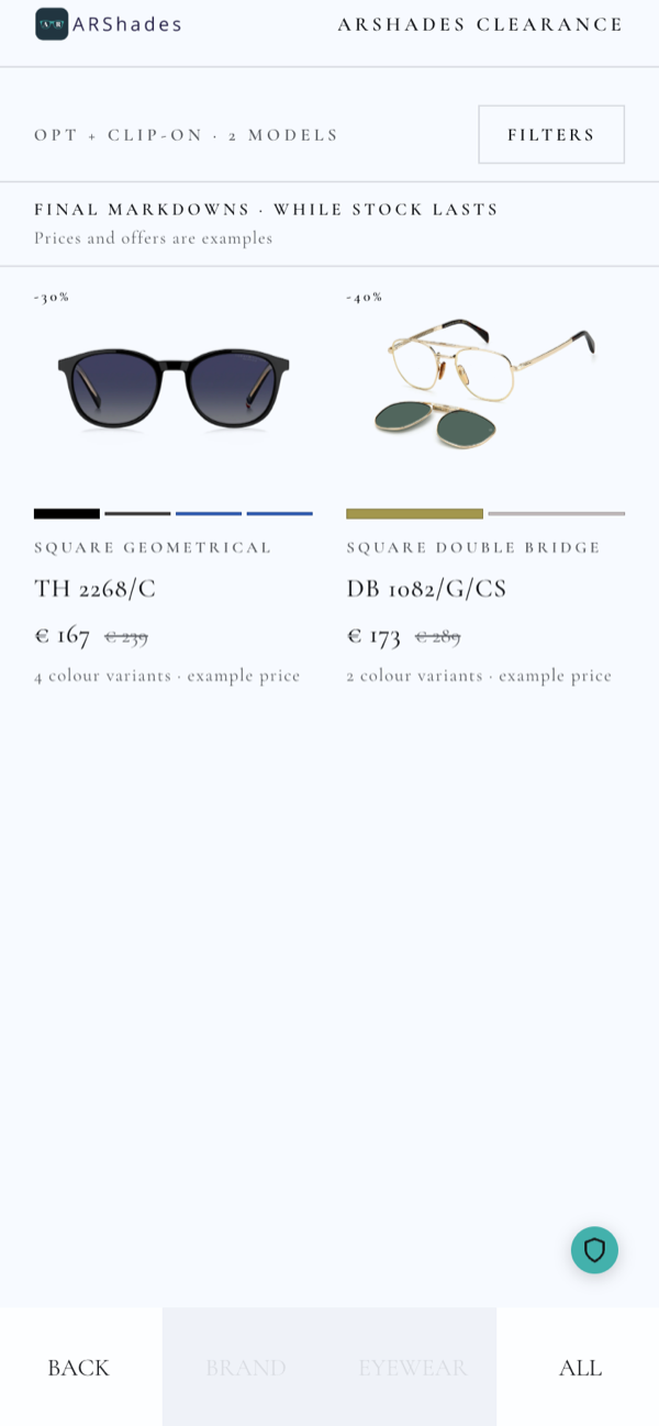
Two things the grid can carry beyond the frames themselves. An editorial tile can sit among the products, so a campaign image or a call to action appears where the visitor is already looking. And where it makes sense — a clearance, a promotion — the cards can show a price and a markdown; there is still no basket and no checkout, the price is information, not a transaction.
7. Looking at a frame
The product page shows one frame in 3D: the visitor drags to rotate it and see it from every angle, including the inside of the temples and the hinge.
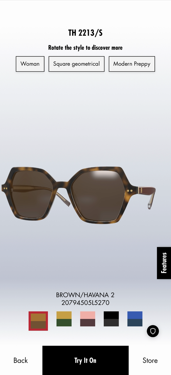
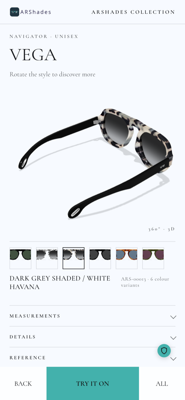
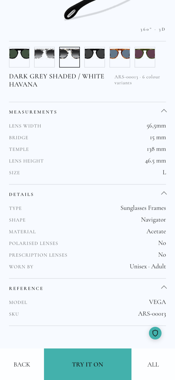
Colour variants are along the bottom, and switching one reloads the frame in the new colour without leaving the page. Below them, three panels open on demand: measurements — lens width, bridge, temple, lens height, size — details — type, shape, material, polarised or not, whether it takes a prescription, who it is for — and reference, with the model name and your own SKU. Everything in those panels comes from the product data you keep in ARShades Studio.
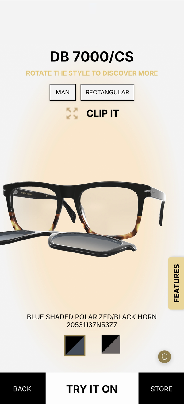
Where a model has a sun clip, the page carries a clip-it control and shows the frame clipped on and off.
From here, one tap on Try it on moves to the try-on.
8. Trying the frame on
The camera opens and the frame appears on the visitor's face, following their movements in real time.
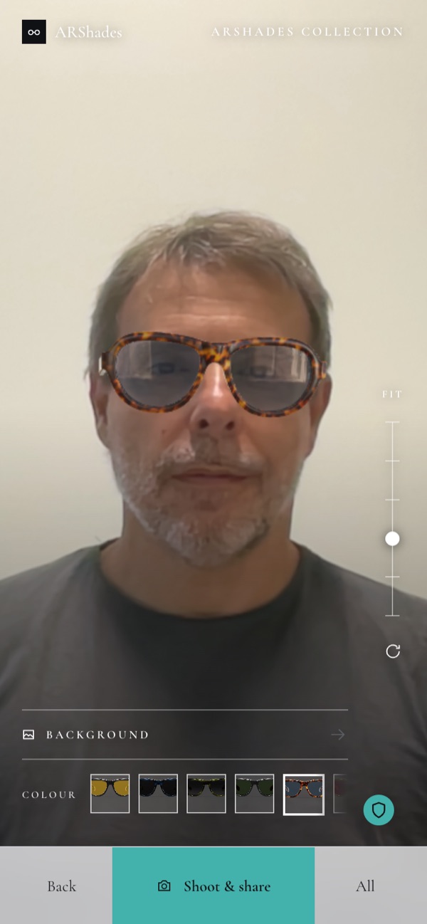
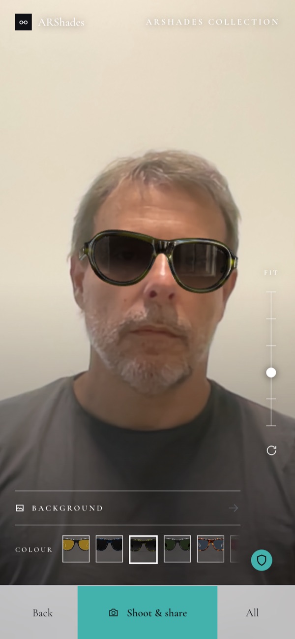
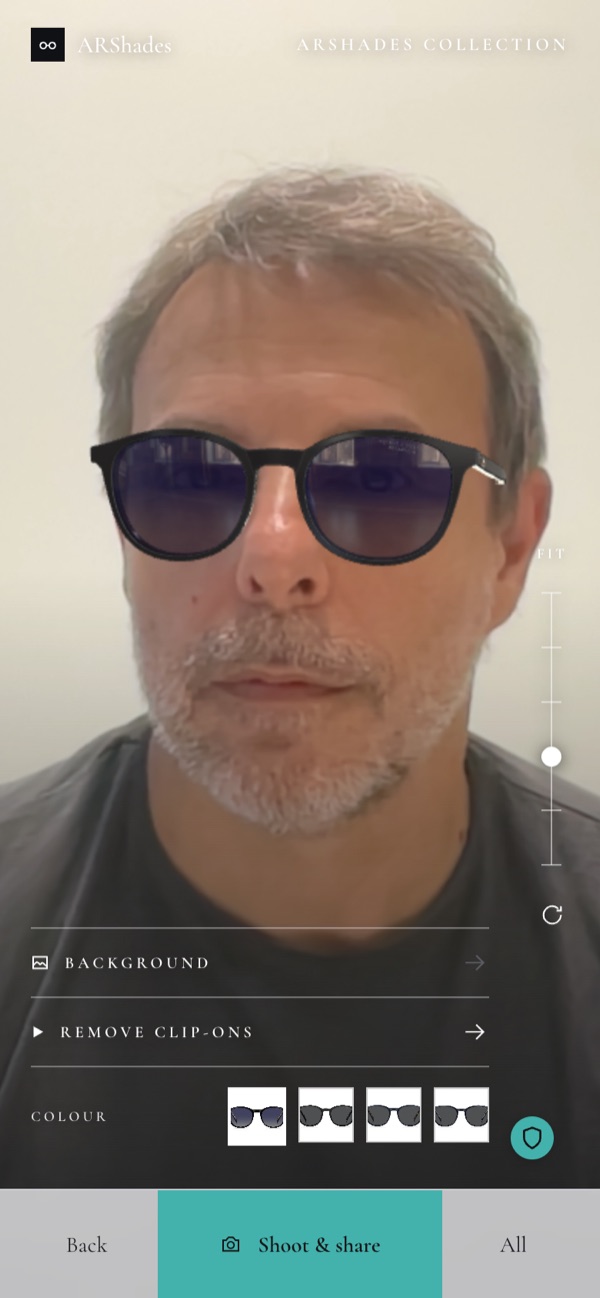
Five things happen without ever leaving this screen:
- Colour. The thumbnails along the bottom swap the frame on the face, straight away.
- Size. Where a model comes in more than one size, the sizes are offered here too, and the frame is rebuilt at the size chosen.
- Fit. The slider on the right raises or lowers the frame on the nose, the way a real pair would sit differently on different faces.
- Clip-ons. On a frame that has one, apply clip-ons drops the sun clip over the optical, and remove clip-ons takes it off again.
- Background. The visitor can be cut out of their own room and placed on a plain colour, a gradient or a scene — useful when the try-on happens in a stockroom or at a busy stand. Backgrounds arrive with the new experience template; ask us whether your Gateway has them yet.
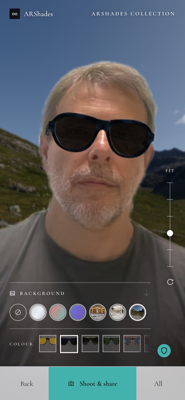
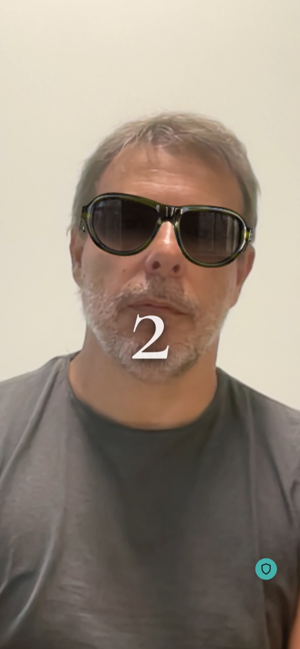
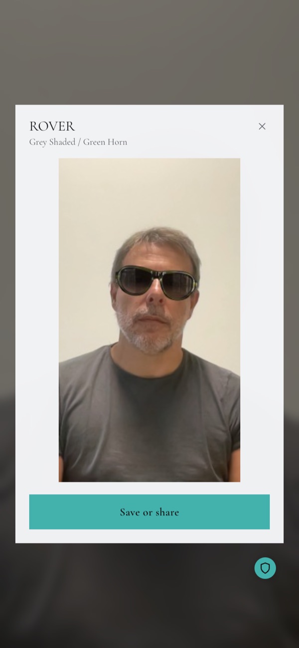
Then the photo. Shoot starts a short countdown — long enough to put the phone down and pose — and the picture comes back named with the model and the colour, ready to be saved to the phone or passed on through the phone's usual sharing options. The saved file carries your banner and your watermark, so the frame keeps your name on it wherever it travels.
Two things are worth telling your customers and your store staff:
- The browser asks for permission to use the camera. If the visitor declines, the try-on cannot start — but the rest of the Gateway keeps working normally.
- The camera image never leaves the device. The frame is placed on the face by the visitor's own phone or computer, and no video or photo is sent to our servers. Photos stay with the visitor.
9. Finding a store
Where the module is active, the visitor can look for the nearest point of sale on a map, or search by city or store name. Zooming in opens up the clusters into individual stores.
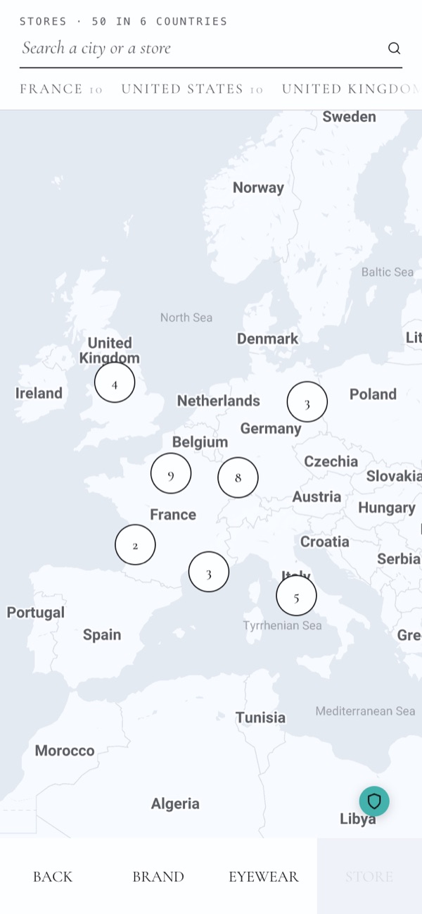
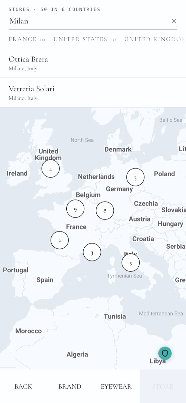
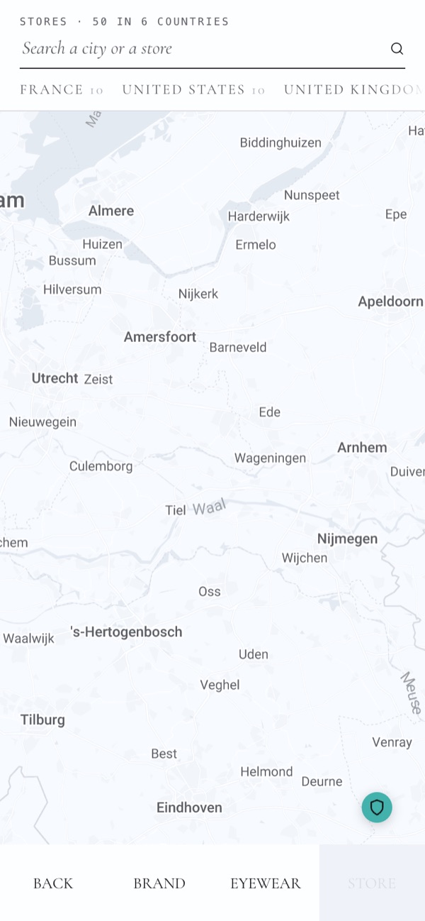
The header counts the network for the visitor — 50 stores in 6 countries — and the search suggests both cities and store names as they type. The stores shown are the ones you provide us with. A dedicated store page, with the details of a single point of sale, is available as an optional module.
10. Privacy, always to hand
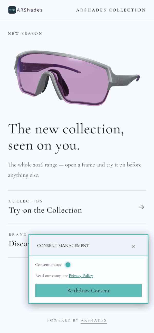
The small shield button, visible in the corner of every screen, opens the consent panel and your privacy documents. Visitors can review their choices, read the full notice, or withdraw consent at any time. Precise location is only ever requested with the visitor's explicit consent.
11. Ready for the next visitor
If a session is left open and untouched — a phone put down on a counter, a tablet at an event — the experience resets itself and returns to the start, ready for whoever comes next.