Last Update: 16/01/2026
Customisation & Branding
The ARShades plugin offers a centralised interface to define the visual identity of your Virtual Try-On (VTO) experience. By configuring these global settings, you ensure a consistent look and feel across all AR interactions on your store.
Global Style Settings
Navigate to the Customization tab in the plugin dashboard to access the design configuration. These settings affect the AR interface overlay that appears when a user opens the Virtual Try-On.
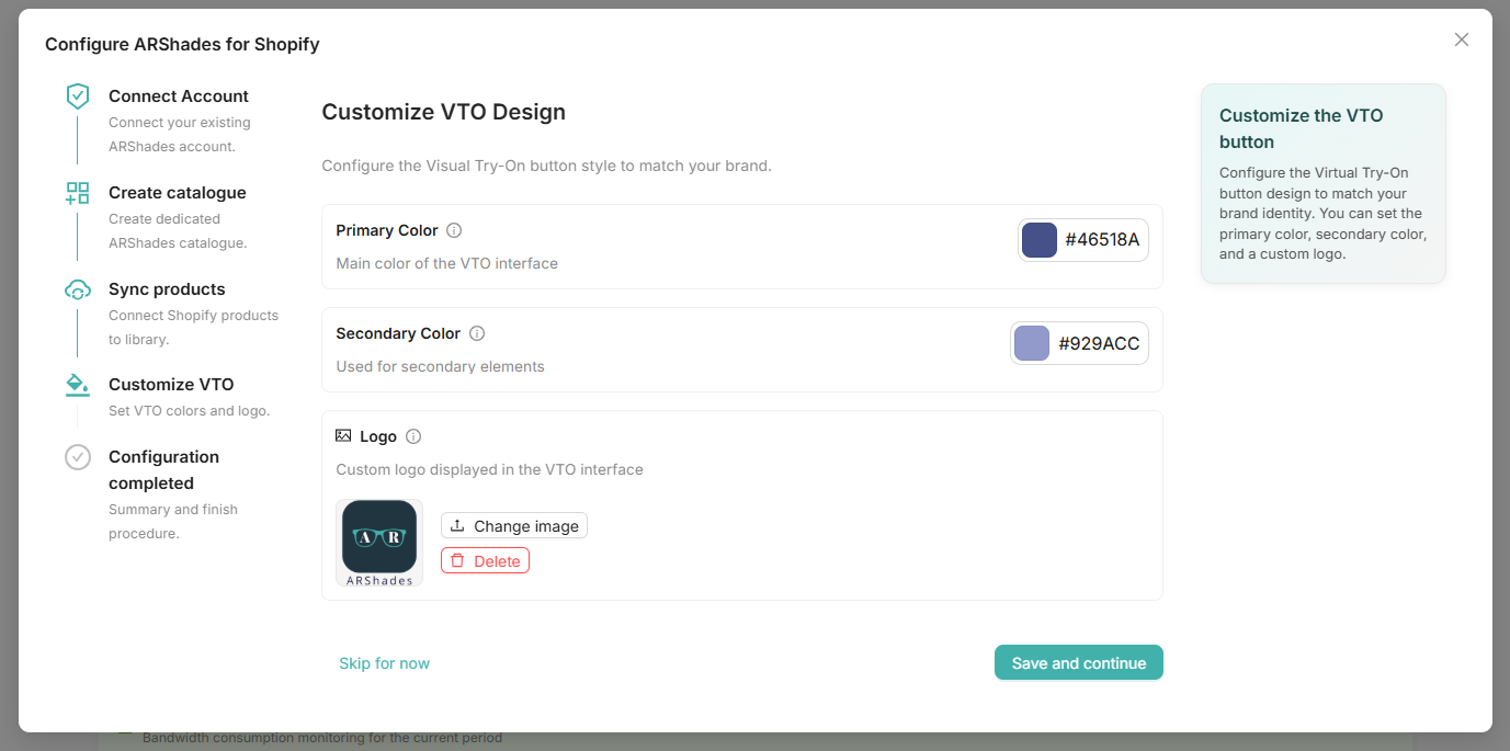
1. Primary Colour
This is the main accent colour used for buttons, active states, and key interface elements within the VTO.
- Recommendation: Use your brand's primary colour to maintain visual continuity.
- Default: A neutral dark shade (#000000).
2. Secondary Colour
Used for secondary actions, backgrounds of inactive elements, or subtle highlights.
- Recommendation: A lighter or complementary shade to your primary colour.
3. Logo Upload
You can upload your brand's logo to be displayed within the AR experience (e.g., during loading screens or in the corner of the camera view).
- Format: PNG, JPG, or SVG.
- Size: Max 2MB. Transparent background recommended.
Theme Integration
Once you have defined your global styles, the next step is to integrate the AR components into your Shopify Theme.
- Switch to the Customise Theme (Preview) tab within the Customization section.
- Select a product from your catalogue to use as a reference.
- Click Open Theme Editor.
This will launch the Shopify Theme Editor directly on the product page, allowing you to drag-and-drop ARShades App Blocks.
Next Step: Learn how to place buttons and viewers in the App Blocks section.