Last Update: 01/04/2026
App Blocks (Components)
ARShades integrates with Shopify OS 2.0 themes using App Blocks. Placement depends on the component: VTO Button and 3D Viewer are intended for product pages, while ARPDMeter can be placed in any compatible theme section/template.
How to Add Blocks
- Open the Shopify Theme Editor (you can do this from the plugin's "Customise Theme" tab).
- For VTO Button and 3D Viewer, navigate to your Product Template (usually Default Product).
- For ARPDMeter, navigate to the target compatible section/template where you want to place it.
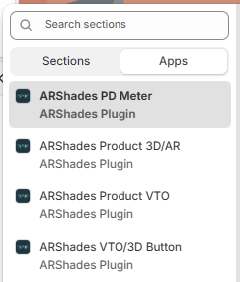
- In the sidebar, click + Add Block in the relevant section.
- Scroll down to Apps and select the desired block.
- Drag the block to your desired position.
- Click on the added block to open the settings panel on the right and configure the options described below.
- Save your changes.
Available Blocks
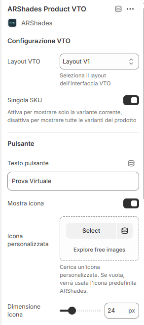
1. VTO Button (Virtual Try-On)
This is the primary component for launching the virtual try-on experience.
Customisation Options
-
VTO Configuration:
- VTO Layout: Choose between interface versions (v1, v2, v3).
- Single SKU Mode: If active (default), opens the selected variant directly.
-
Button Appearance:
- Text: Customise the label (e.g., "Virtual Try-On").
- Icon: Show/hide icon, upload custom icon, adjust size (16px-48px).
- Colours: Define background, hover, and text colours.
- Dimensions: Width (100%, Auto, 50%), Custom padding, Border radius (0-30px), Font size (12-24px).
-
Modal Configuration:
- Dimensions: Desktop and mobile width/height (50-100%).
- Style: Modal border radius, Overlay opacity (0-100%), Background colour.
- Loading Text: Message shown whilst opening (e.g., "Loading...").
Note: VTO blocks will only appear on products that are successfully synchronised and have the correct ARShades metafields.
2. 3D Viewer Button
Opens an interactive 3D viewer of the product in a modal.
Customisation Options
Similar to the VTO button, it offers comprehensive options to match your theme:
- Button: Text (e.g., "View in 3D"), Customisable icon (default 3D cube), Colours (Default: Dark Blue #1a1a2e), Dimensions, and Borders.
- 3D Modal: Full control over dimensions, border radius, background opacity, and loading text ("Loading 3D...").
Note: 3D blocks will only appear on products that are successfully synchronised and have the correct ARShades metafields.
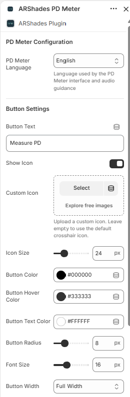
3. ARPDMeter Component (PD Meter)
Adds a guided pupillary distance measurement experience directly in any compatible section of your storefront.
The ARPDMeter block requires the ARShades VTO Embed App Embed to be enabled in the theme. This embed loads the JavaScript bundle that the PD Meter depends on. Without it, clicking the button will produce the error: VTO bundle not loaded. Ensure vto-embed-loader is enabled in theme settings.
This is required even if you are not using VTO features. See Embed Components for how to enable it.
Customisation Options
Click on the ARShades PD Meter block to open the settings panel:
-
PD Meter Configuration:
- PD Meter Language: Language for the measurement interface and audio guidance. Automatically uses the store's language if supported (English, Italiano, Deutsch, Español, Français). Falls back to English if the store language is not supported or no override is configured.
-
Button Settings:
- Button Text: CTA label (default: "Measure PD").
- Show Icon: Toggle icon visibility next to button text.
- Custom Icon: Upload a custom icon or use the default crosshair.
- Icon Size: Adjustable via slider (default: 24px).
- Button Color: Background colour (default: #000000).
- Button Hover Color: Hover state colour (default: #333333).
- Button Text Color: Text colour (default: #FFFFFF).
- Button Radius: Border radius in pixels (default: 8px).
- Font Size: Button text size (default: 16px).
- Button Width: Width mode — Full Width, Auto, or 50%.
Functional Behaviour (High Level)
- User clicks the PD Meter button from the section where the block is placed.
- The measurement interface opens with visual and audio guidance in the configured language.
- A readable measurement result is displayed at the end of the flow.
The entire experience runs in the browser without additional app downloads.
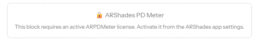
License Dependency
If the ARPDMeter license is not active, the block will display a warning message instead of the functional component:
For full details on the ARPDMeter component, see the dedicated ARPDMeter Component page.