Last Update: 01/04/2026
ARPDMeter Component
This page describes how to add, configure, and customise the ARPDMeter block in the Shopify Theme Editor across any compatible section or template of your storefront.
Prerequisite: Enable ARShades VTO Embed
The ARPDMeter block requires the ARShades VTO Embed App Embed to be enabled in the theme. This embed loads the JavaScript bundle (and CSS) that the PD Meter depends on. Without it, the PD Meter cannot function.
To enable it:
- Open Shopify Admin > Online Store > Themes > Customize.
- In the left sidebar, click the App Embeds icon (bottom-left).
- Find ARShades VTO Embed and toggle it On.
- Click Save.
If this embed is not active, clicking the PD Meter button will produce the following error in the browser console:
[ARShades PD Meter] VTO bundle not loaded. Ensure vto-embed-loader is enabled in theme settings.
This step is required even if you are not using VTO features (Virtual Try-On). The ARShades VTO Embed acts as the global resource loader for all ARShades components, including the PD Meter.
Adding the Block in Theme Editor
- Open Shopify Admin > Online Store > Themes > Customize.
- Navigate to the template or section where you want to place ARPDMeter.
- In the sidebar, click + Add block in the target section area.
- Under Apps, select ARShades PD Meter.
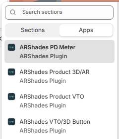
You will also see the other ARShades components in the list:
- ARShades PD Meter — Pupillary distance measurement.
- ARShades Product 3D/AR — 3D product viewer.
- ARShades Product VTO — Augmented reality virtual try-on.
- ARShades VTO/3D Button — Combined VTO and 3D button.
- Position the block in a high-visibility area (near price, variants, or the buy button).
- Click Save.
Configuration Properties
Click on the ARShades PD Meter block to open the settings panel on the right:
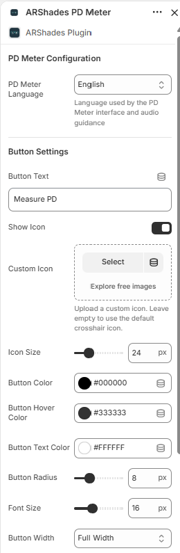
PD Meter Configuration
| Property | Description | Default |
|---|---|---|
| PD Meter Language | Language used by the PD Meter interface and audio guidance. If the store's language matches one of the supported languages, it is used automatically. Otherwise, English is applied as fallback. You can override this by selecting a specific language in this setting. | Store language (if supported), otherwise English |
Supported languages:
| Code | Language |
|---|---|
en | English |
it | Italiano |
de | Deutsch |
es | Español |
fr | Français |
Button Settings
| Property | Description | Default |
|---|---|---|
| Button Text | Text displayed on the CTA button. | Measure PD |
| Show Icon | Show or hide the icon next to the button text. | On |
| Custom Icon | Upload a custom icon image. Leave empty to use the default crosshair icon. | — |
| Icon Size | Icon size in pixels (range slider). | 24 px |
| Button Color | Button background colour. | #000000 |
| Button Hover Color | Button colour on mouse hover. | #333333 |
| Button Text Color | Text colour on the button. | #FFFFFF |
| Button Radius | Border radius of the button in pixels. | 8 px |
| Font Size | Font size for the button text. | 16 px |
| Button Width | Button width option (Full Width, Auto, 50%). | Full Width |
How It Works for End Users
The ARPDMeter flow is a guided step-by-step experience:
- The customer clicks the Measure PD button (or the custom text you have configured).
- The measurement interface opens, guiding the user with visual and audio instructions in the configured language.
- At the end, the customer receives the measurement result in a readable format.
The entire experience runs in the browser — no additional app installation is required.
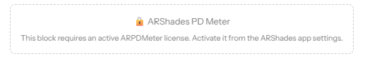
License Dependency
If the ARPDMeter license is not active, the block will display a warning message instead of the functional component: